8 Signs It’s Time for a New Logo
What’s the most important part of your branding? You guessed it… your logo. How do you know if your logo is depicting the image you want for your business? Here are 8 signs that it’s time to redesign your logo.
- Your cousin’s daughter, who took an art class in 6th grade, designed your logo. A logo is one of the first things a prospective client will see when they visit your website or receive communication from you. Therefore, it should be one of the most important marketing investments you make for your business. Hire a professional who knows what will best represent your business and what graphical compositions, lettering and style are aesthetically pleasing.
- Your logo was designed in 1992, and it shows. Yes, the 90s are back, and the 80s are too as far as fashion is concerned. But a logo that looks like it came from those eras does not look cool. Keep in mind, there’s a big difference between a dated logo and a traditional logo. Traditional logos have a classic and timeless look to them. It’s the type of logo that depicts a well-established company. A traditional logo can also represent a company focused on one-on-one communication and building relationships with their clients. A dated logo has elements that were trendy during a particular period, but are not any more, like mullets. It can give off the impression that a company doesn’t care about their brand.
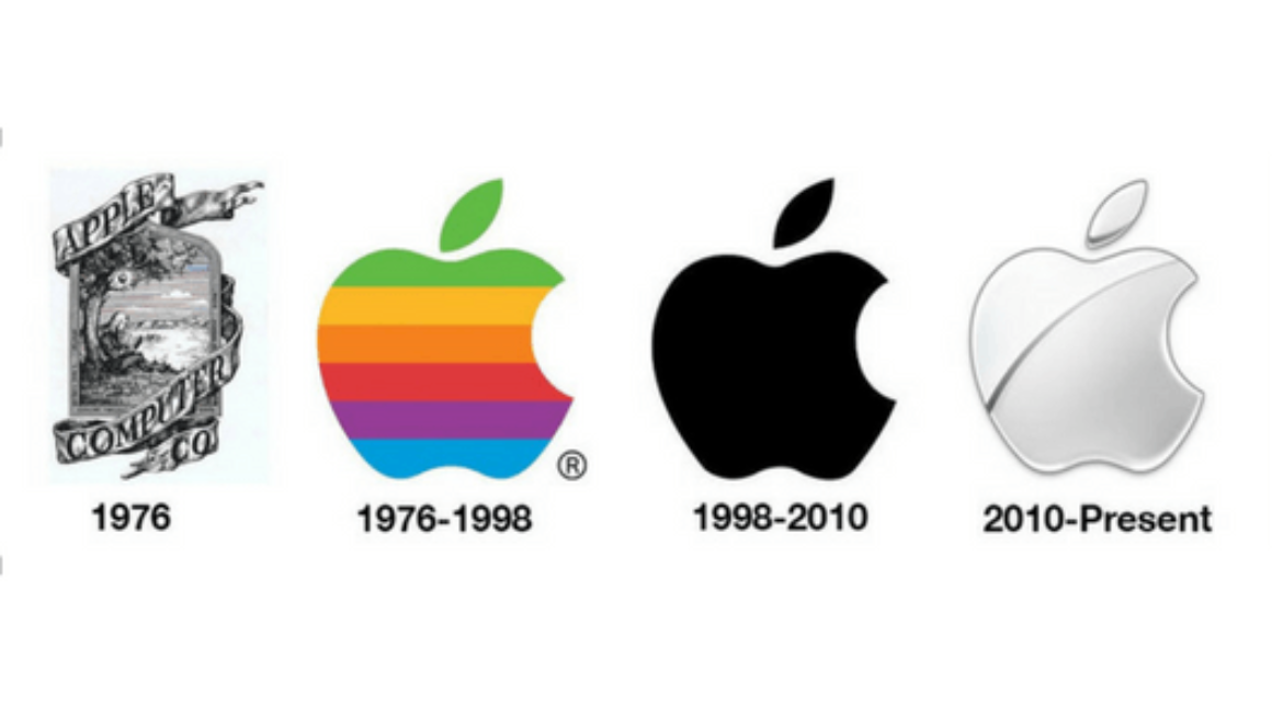
- There are more than 3 different graphical elements on your logo. A busy logo can be confusing to consumers, especially if some of the elements are very small. A well-balanced logo can be very powerful. For example, Starbucks has simplified their logo, while still keeping the essential image that makes it unique and recognizable.
- The font used is Comic Sans. The font used in a logo could potentially make or break it. A dated or hated font can ruin even the best designs. Every font has a personality and if paired up with graphical elements that don’t match that personality, the design of the logo can look confusing rather than well-balanced. For example, one of the reasons Comic Sans is one of the most hated fonts by designers is because it’s been overused in professional designs where other better suited fonts should’ve been used . A font like Comic Sans is more suited for childlike projects such as comic books. Choosing the right font should be as important as designing the icon of your logo. Some of the fonts you should avoid, not only on your logo but on all of your marketing materials, are Comic Sans, Papyrus, Bradley Hand, Viner Hand, Lucida Handwriting, Courier, and Brush Script. To learn more about best practices on font usage, read our blog post How Fonts Impact Your Insurance Website.
- You are not happy with your logo. Period. If you don’t love your logo, it’s definitely time to hire a professional to design a new one. Once you make that decision, gather as much information as you can about what you want out of your new logo. For example, how do you want your clients to feel about your business when they see your logo? What company logos do you love, and which ones do you hate? These are just a few details that will help your designer create the best logo for you.
- Your employees do not like your logo. Not everyone is going to like your logo, and that’s ok. But if the majority of your employees have expressed strong dislike, chances are there’s a good reason for it. Listen to your employees as they know your business and your clients as well as you do.
- Your website and marketing materials outshine your logo. Your logo is going to be at the top of your website and at times it might be the focus on some of your marketing collateral. If your website is cool and modern, your logo should also be cool and modern, not outdated or traditional. To create a stronger brand for your business, your promotional materials and your logo should compliment each other, rather than look as if they don’t belong together.
- Your logo is a photo of something or someone. Never (again) use a photo as a logo, even if it’s a great photo. A logo should be symbolic, letter-based or a harmonious combination of these two. For example, Travelers uses an umbrella icon on their logo rather than a photograph of an actual umbrella.
A good professional logo can help solidify your credibility with clients. Try to look at your logo from an unbiased point of view. If it sounds like some of the examples we’ve mentioned, it’s probably time to update it.
Source: Getitc.com


