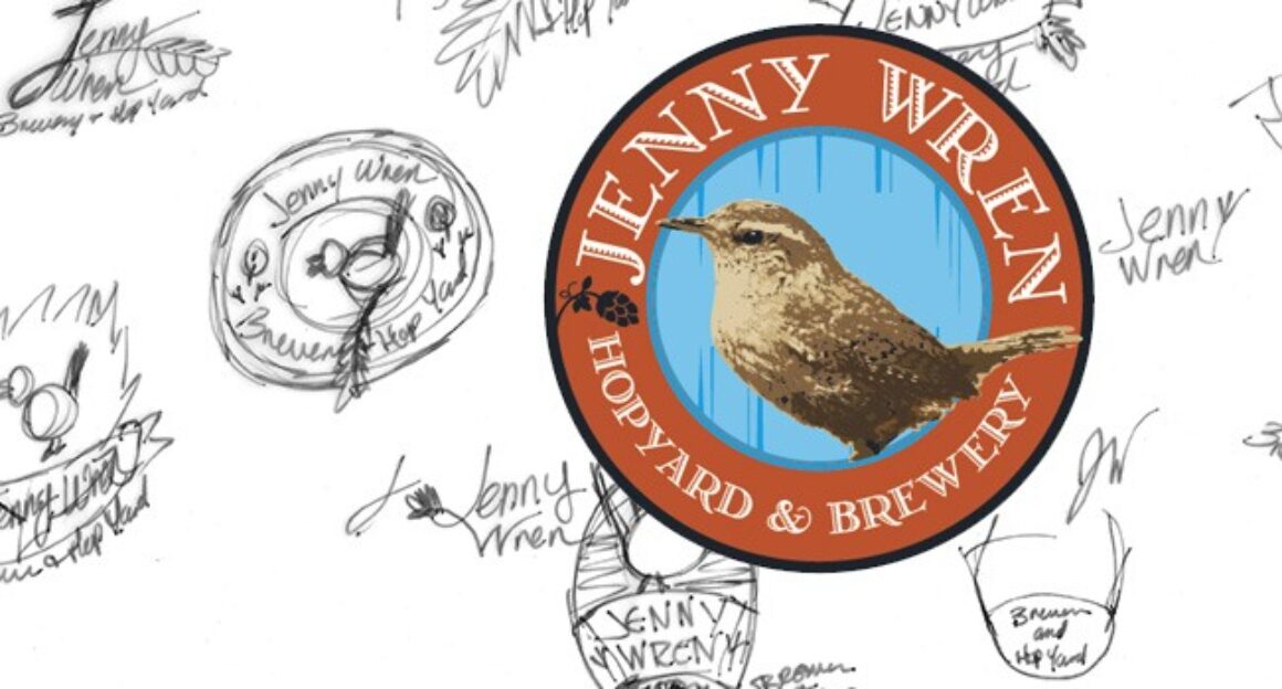
Logo Design from Start to Finish: Jenny Wren
:Within the last few months, we’ve been involved in helping a lot of companies give their brand an identity with a new logo design. One of the most recent logos I worked on was for Jenny Wren – Hopyard & Brewery, a new business in Wisconsin.
After the kick-off meeting with our client to go over what his new company was all about, who he was targeting, what inspired him to start this new venture, how he and his wife saw the brand unfolding and coming to life, and where the name came from, we were ready to start bringing Jenny Wren – Hopyard & Brewery to life.
In speaking with our client we learned that he wanted to have an actual jenny wren in the logo – to have her be the star of the show and a real character, just like an actual wren. We also discussed how the logo should include a hop and how it needs to be usable to a variety of materials (letterhead, shirts, glasses, labels, website, billboard, signage, etc.) as all logos should. For those that are unfamiliar with what a wren is; it is a medium-small to very small brownish bird, rather inconspicuous, except for its loud and often complex songs.
Step 1: Put Pen to Paper – Sketches & Ideas
The first thing I did was look up what a jenny wren was and what they looked like. I had a vague idea since I had grown up hearing their songs and seeing them in rural north-central Minnesota. I found some photos online that I used for references and got to sketching. In about 5-10 minutes I had nine rough sketches that fit what our client had talked to us about.
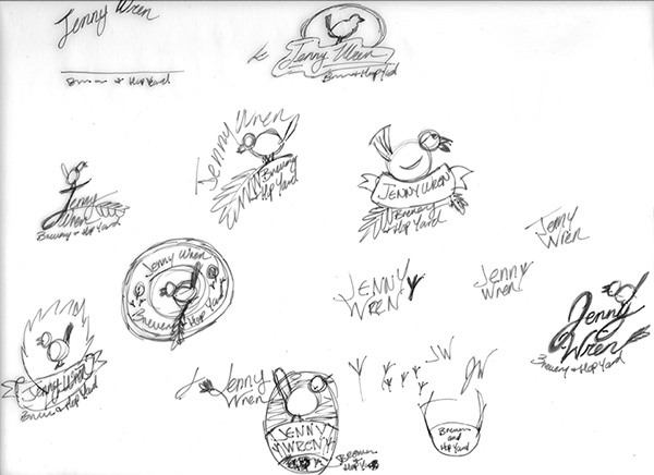
As we reviewed them as a team I explained where I saw each one going and we picked three of them to explore and refine (see below).

Step 2: Computer Renditions – Black & White Logo Concepts
To start the concepts I needed three different jenny wrens – one for each logo. After finding three birds with distinct expressions, looks, and attitudes, I started building the logos in black and white / grayscale. We don’t start building in color because we want to get the form and feel down first. Once a concept is chosen by our client we focus on colors.
Logo One: The Bird & Barrel
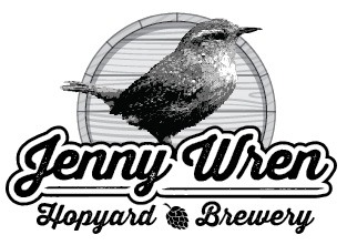
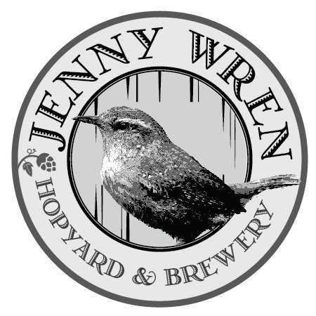
The first logo that I did was of a jenny wren in front of a wooden beer barrel. Simple and straight to the point, but with some edge and texture in the font chosen for Jenny Wren, Hopyard, and Brewery. The text “Jenny Wren” was to look a little more like a signature – a nod to the fact that Jenny Wren is a real character.
Logo Two: The Label
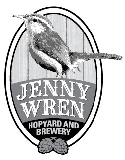
Logo two was inspired by beer labels. Even though it was only in grayscale I could already see it in color and on a beer bottle or a glass. I had a few different options for background textures behind the bird, but in the end we went with the barn boards since they are part of our client’s actual brewery. The font I used has curved serifs and accents in each letter giving it a slightly more feminine feel.
Logo Three: The Bird & Her Barn
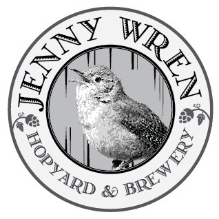
As you can see – the original jenny wren chosen for this logo had a big personality. She’s all ruffled about something and is letting everybody know it. The boards behind the bird are more stylized giving the feeling it could be either a barn or a barrel. I used a font that had a woodcut feel to make the logo a little more rustic.
Next, each grayscale logo was setup with each bird and then sent to the client for review. In the end, he chose the round logo with the bird from logo one.
Step 3: Adding Some Life – Color Concepts
After the client decided on which logo he thought best represented his brand and business, it was time to add color! After doing some research, I did seven color variations to show our internal team. Besides the color of the bird staying the same in all of the logos, I also wanted to give a nod to the fact that the barn at the hopyard and brewery is not your average red barn. In fact, it’s not a red barn at all – it’s blue!
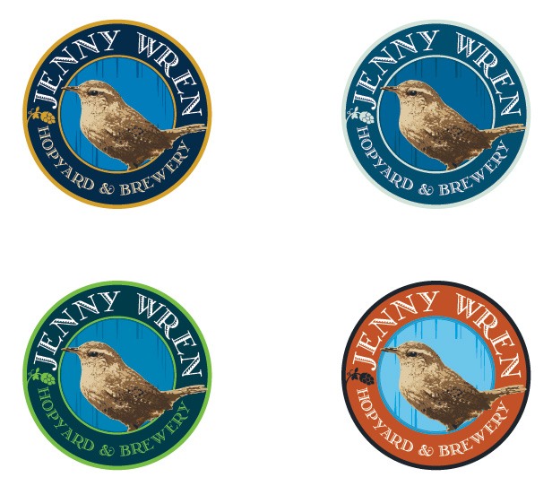
We settled on the above logos to show the client. We felt that each gave its own unique feeling to the brand and would be great no matter which one he chose. In the end he ended up choosing number 4 – the orange and blue logo.
Say Hello to Jenny Wren
In the farmlands of western Wisconsin lives a little bird; her name is Jenny Wren. She lives next to a big blue barn and a tall antique windmill, and works at a hopyard and brewery. She’s a proud little lady with a big voice and even bigger attitude. In short, she’s a fabulous little creature that can’t wait to meet you when you stop by for a pint.
