Responsive Logos – Change is in the Air
What if logos were responsive like websites? What if they changed based on what size they were, or what context they were used in? Crazy talk right? Not really, there’s been talk in the design community for a while about responsive logos.
What is a responsive logo? They’re logos, like websites, that change (not just resize) based on screen size or application.
I think that the people over at The Deep End Design Podcast put it well when they said that the overall idea of responsive logo design is that, when you design a logo you keep all of the uses in mind. Just like you design a logo for a variety of sizes and uses, business cards, billboards, online, packaging, etc. you now have to keep responsive websites in mind. It wouldn’t be just designing one logo anymore, it could be that you design a series of logos for different uses based on sizing that will scale up or down depending on use.

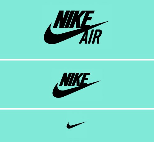
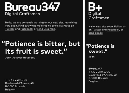
You can see some great examples of this at The Responsive Logos project website by Joe Harrison. This site takes big brands like Coca-Cola, Nike, Levi’s, Guinness, and more and changes them as the screen resizes. Take the Nike logo for example, first the Air text is taken out, then Nike is gone, finally leaving just the Nike swoosh. Another cool example of responsive logo design is the Bureau347 website.

But, if this started to really take off what effect would this have on logo design? Designers are taught to keep everything in mind when designing a logo. Responsive logos would warrant an extensive brand guideline book to help the client, and anyone that does work with their brand, know how and when to use the various versions of the logo.
A good example of this would be to design two logos. One main logo would be designed for use on t-shirts, billboards, posters, etc. From the main logo a simplified version, like an icon look/feel, would be created for social media and other small applications like business cards or embroidery.
Another thing to think about would be recognition and user experience. I agree with Joe Harrison of UX Magazine when he states that: “If an icon changes in style, does this make it more difficult to remember? The answer is initially, perhaps, but optimization will always require differences in appearance of design, and as users become more attuned to icons on different devices within a particular brand, this problem will disappear. If anything, the changing icon may attract a user’s attention, creating a more engaged user.”
Keep in mind; this wouldn’t necessarily be for everyone. Like Joe Harrison said: “Whether the concept of responsive icons is a valid technique for the future is uncertain. But it’s safe to say that creating flexible and scalable solutions that are optimized for today and considered for tomorrow can only benefit users.”
Varieties of opinions abound in the design industry about responsive logos and if they’re here to stay or just the fad of the month. Check out the following articles to learn more and get a well rounded view on this interesting topic.
Responsive Icons and Logos for the Responsive Web


