7 Brand Style Guide Essentials
I just finished a catalog project here at BLU. As with all design we do, it was branded in a style consistent the client’s brand message and image. It used appropriate fonts, colors, tone of copy, design elements, etc. – all based on their style. But how does a business get to the point of having a style? And once the style is established, how does that remain consistent to help strengthen their brand?
The short answer to that question is developing and following a brand style guide. Let’s look a little deeper at what this means.
What is a Style Guide?
When we are first working with a client, a lot of research goes into getting to know them, their objectives, target audience, their competition, and much, much more. In order to do our best work, we need this information. From a design standpoint, the details gleaned allow us to evaluate a client’s image and make appropriate adjustments. This ranges from a few design tweaks to full scale image redesigns.
In regards to full scale image redesigns, the best approach would be to have a client who is willing to scrap everything now and apply the new style to everything done from the launch point forward, but in a practical sense this is rarely financially feasible. In most cases we help a client move toward an improved brand a little at a time with each project we work on. No matter how we are adjusting course – a little or a lot – that first project is huge if there isn’t an established style guide because it will serve as the foundation of their new or redefined brand style.
You see, a style guide does exactly what its name says – it directs the style of advertising and marketing within a set of guidelines to help the brand remain consistent across all mediums. Once a style guide is built, it can be followed by all internal and external creatives doing the work. If everyone follows the guide, the brand remains consistent and grows stronger. A brand style guide should be used to define styles for all of a brand’s communication – graphical, written, and auditory.
Essential Sections of a Brand Style Guide
- Logo
- Color Use
- Fonts
- Layout Grids
- Tone of Voice
- Copywriting Guidelines
- Web Guidelines including Social Media
Let’s take a deeper look at just one defined section of a style guide – logo usage.
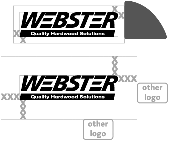
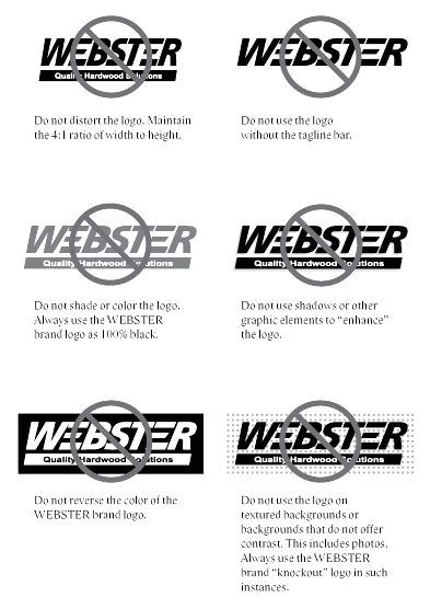
For print and online, a company’s logo is at the core of the brand. There are many standards which need to be defined regarding the logo and its proper use including proportions, clear space, minimum size, color options, and examples of incorrect use. Here are a few examples from a style guide we developed for one of our clients.
Proportion: The logo should always appear in these exact proportions. Never scale the logo disproportionately.

Clear Space: The clear space of the logo is a safe zone around the logo to keep other elements from competing with it and to preserve its visual impact, legibility, and integrity. This defines the minimum space required.

Incorrect Usage Samples: Examples of how a logo should not be used.

Professionals will know not to mess around with a logo, but many others (externally and possibly even internally) may try and do things with a logo to help with what they are designing. A brand style guide should provide many incorrect usage examples to steer them clear of using the logo in a way which will be damaging to the brand.
As you can see from looking at a few elements of a logo section, there is a lot to consider when presenting your brand style to your customers. For a complete and very well done example of a corporate brand style guide check out this one for Skype.
So how are you doing? Does your business have a style? Is that style consistent? Could you use some help defining your brand personality with a style guide? We are brand champions and would love to assist you in defining your brand. Give us a call at 608.519.3070. We would love to help.


