Five Tips for Designing and Using QR Codes
 They’ve been popping up more and more in newspapers, magazines, clothing, point of purchase displays, leave-behind materials, and a bunch of other places. No longer just in black and white, they’re now showing off their pixels with rounded edges, colors, logos, and even textures. They’ve been around for a while, but are they here to stay, or are they just a fad? Those crazy QR Codes (quick response codes); what do they think they’re up to?!
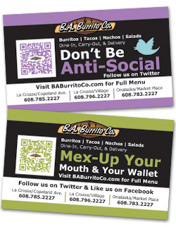
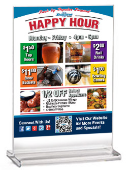
Ok I’m being funny, but seriously, QR Codes are getting better looking by the day. It’s still up-in-the-air if they’re just a fad or if they’re here to stay. We’ve started using them more often for some of our clients to use on their in-house products like posters, promotional cards, buck-slips, and table tents. But how do you keep the QR Codes fresh and new looking, instead of having them fade into the background? Where are good places for them to be used? What can they be used for?
Types – QR Codes can be used for weblinks, sending an e-mail or SMS message, showing the user a plain text message, adding an event to the users calendar, call a phone number or get an exact geolocation, even connect the Smartphone to a wireless network (Android only), and more. There’s even a QR Code that will talk to you (Tokkers.com)! Two QR Code generators that I like to use areDelivr and Unitag. Delivr gives you the choice of downloading a vector file of your QR Code for free. Unitag gives you lots of free customization options and helps you see right away just how fancy QR Codes can get.
Customizations – Depending on your design, a normal black and white QR Code could either get lost or look like an afterthought. Instead of having your code overlooked, integrate it into the design by changing the color (code color or background color) or size, add a texture inside the code, add a logo or image to the middle of the code, round the pixels instead of squaring them, change only some of the pixels to a different color, etcetera. There are so many options. Remember to test your code often to make sure that whatever changes you made didn’t make it unreadable. You can get some really cool looking QR Codes, but they won’t do any good if they can’t be scanned and read by a Smartphone.
Readability – Make sure to test your code after you make it, during customization, and when its in place within the design, to make sure that it’s still readable. Some things that can make a code not readable are:
- Not enough contrast between light and dark areas / colors. Some scanners / readers can’t decode a QR Code that has been inverted (white on black).
- Not enough white space (empty space) surrounding the QR Code. Having enough white space makes the QR Code more readable, and sometimes is crucial to the reading of the QR Code.
- Not enough redundancy in the QR Code. There are four levels of redundancy: L (Light – 7%), M (Medium – 15%), Q (Quality – 25%), and H (High – 30%). The higher the level of redundancy, the more resistant the QR Code is to damage (fading, logo overlay, etc.) However, a lower level makes the QR Code more readable and smaller.
 Also, just because it works with your QR Code scanner, it doesn’t mean it will work with every scanner. Have a couple different scanner options on your phone to test your codes with, and have some coworkers help you test your QR Codes (especially if they have a different phone (Android/Apple) than you).
Placement – Placement isn’t just where the QR Code will be on the design, but where that design will ultimately end up. If it’s going on a poster, where will that poster be put? If it’s going to be in an area that might not have access to a mobile network, your QR Code is useless. Posters, newspaper / magazine ads, table tents, buckslips, business cards, and direct mail, are examples of good places for QR Codes. Billboards can also be used, but remember that placement is important; people driving aren’t going to be able to scan the QR Code and drive at the same time. If the billboard is along a highway, scanablility / readability could be a big issue. If the billboard is in an area with lots of foot traffic, then it should work out just fine.
Audience – Besides making sure that the QR Code looks good and is readable, you need to have a reason for customers to scan the code. What will they get in exchange for scanning the QR Code? You may need to explain to your customers how to use the QR Code; not everyone knows what they are or how they work.
Whether QR Codes are a fad or here to stay, with these tips in mind you should be off to a great start. If you need any help or advice on using QR Codes in your designs / campaigns, feel free to give us a call at (608) 519-3070 or e-mail us at info@theblugroup.com.


