The Power of Fonts
I have recently been working on a project which has stretched me as a designer in an area I thought I had quite a bit of expertise – fonts. The specific challenge is choosing a font for a new logo. I’ve spent a good amount of time studying and considering several options and I’m still not satisfied with the results. Some of you reading this may be thinking, “What’s the big deal?” while others are saying to themselves, “I know fonts are important, but is it worth as much effort as what you’re putting into it?” The answer to that question is definitely yes.
Let’s consider fonts for a moment and the impact they have on our lives. Think of how much information enters your eyes on a daily basis through the books, magazines, news articles, labels, signage, reports, texts, e-mails and so on you read each day. Every piece of written communication uses fonts and the fonts used have a huge impact in the way that communication is received and processed. Fonts can enhance or detract from all those messages. The goal of any designer and the goal in my current project is to pick the right font to compliment the message, make it easier for the target audience to receive what the client wants communicated. Herein lies the power of the font.
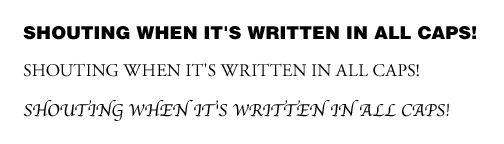
Take for example the classic illustration of text SHOUTING WHEN IT’S WRITTEN IN ALL CAPS! The same words written in a serif font or a handwritten script will not have the same impact as the words written in a sans serif which is bolded, even if each example is written at the same size and in ALL CAPS. To most effectively communicate the intended message you need the right font. Seems pretty simple, but this very important design principle is often overlooked in small and large businesses alike.
One of the most visible places to see the power of fonts is in a logo. We recently redesigned a logo for one of our clients – ABEE, Inc. – a high ropes and challenge course design and training company. One of the changes they wanted the new logo to convey was their recognized position in the market as a leader in challenge course technology. Another consideration was the customer base which is not only environmentally minded but also technologically savvy. A lot went into redesigning the new logo but let’s just focus on the font.
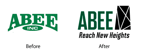
The logo they had been using contained a heavy black serif which did not convey their leadership and technological standing. The heaviness weighed down their name (not something you want to do if you have climbing as part of your business). In then end a font for the logo was chosen which highlighted their qualities and enhanced the brand. It’s a sans serif which is more modern, provides clean lines, is easy to read and positions them as being more technical. The height of the lettering gives a sense of climbing or vertical height which is a huge part of their business. It’s bold enough to give the company name presence but not so bold that it’s weighed down as before.
Overall, the new font fits the personality of ABEE much better than the original. As we continue to help them grow their business, the same personality traits will be used to guide the font choices for all the work we do for them, from ads and brochures to internal work orders and their website.
So what about your business – is the power of fonts working for you or against you? Are you picking the best font to represent your business’ personality? And once you have the right font, is it being translated into every piece of communication you deliver to help strengthen your brand. Need help with choosing the font or implementing its use throughout your marketing? Give BLÜ a call at 608.519.3070.